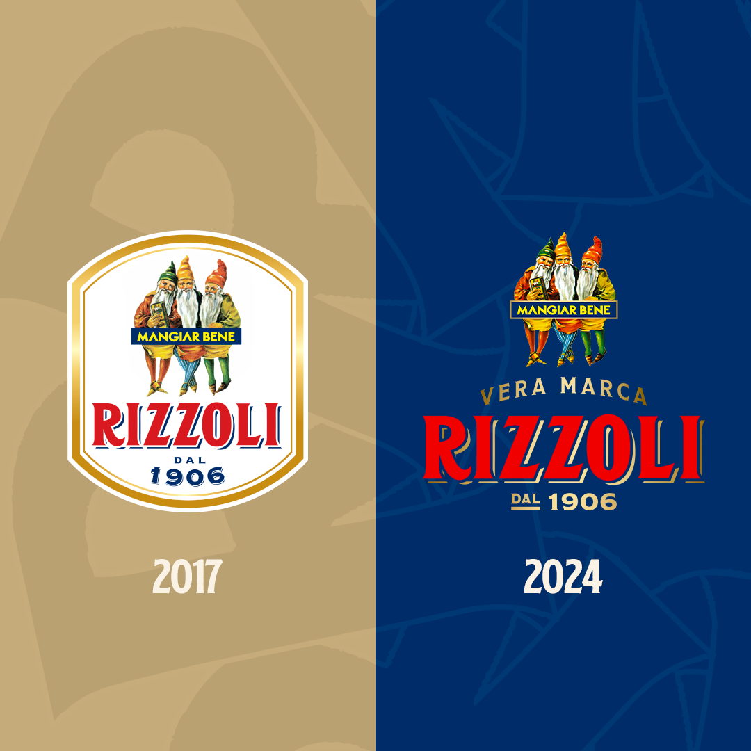
We start the year with an important change: the new Rizzoli Emanuelli logo, which draws inspiration from our past, a precious heritage of which we are very proud.
With the desire to maintain and enhance the origins but with the drive to evolve, we have given new life to our iconic elements, no longer enclosed by the white shield.
⭐The three gnomes, a symbol of good omen, health and longevity, which recall our centuries-old roots.
⭐ The year of foundation, the writing “Eat well”, the three institutional colors, red, gold and blue, which contain our fundamental values.
⭐ “Vera Marca”, a wording that was lost but has now been recovered, which recalls in shape the old Art Nouveau style factory of Rizzoli in Parma.
“This renewal is not intended to be a change of direction but a way of describing an evolution and keeping track of what has been done and built in over a century, despite the commitment and foresight of looking ahead”, comments Massimo Rizzoli, fourth generation and Operating Vice President of Rizzoli Emanuelli.
For us, an important step towards the future.
